

If you should want your graphics to appear with smooth edges, not jagged
as the little squares of color that they're really made up from, you need
to use the anti-alias feature of PSP. When adding text, make sure the
anti-alias box is checked, then you will get various shades of inbetween
colors blending the color of your object to the background color. Let
me show you an example.... A picture is worth 1000 words!
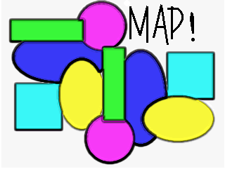
The first "Testing" (and the 2.. at the bottom...) on this graphic is
done with anti-alias checked and it demonstrates how the program adds
shades of gray between the white and black to smooth the edges of the
text. This is saved as a gif file.
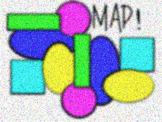
To demonstrate the difference in file sizes between gifs and jpgs, I
also saved the same graphic as a jpg. The file size jumps from 4.9k
for the gif to a whopping 14.3k for the jpg! The rule of thumb is to
use jpgs for photos and gifs for line art, although it is a good idea
to check your file size both ways, because sometimes, you will be
surprised with actual file sizes. Here's the same thing as a jpg:
I spent a lot of time playing with the sigs this week, using posted
tutorials and just fiddling around. I think some of the stuff I did
there qualifies as lesson stuff. Especially since I'm away from home
and my bookmarks AND the class is down, so I can't get in to see the
exact assignment! So... please take the time to hit the link to visit
my sigs page while you're here.
Other techniques I played with this week to create simple graphics included,
but are not limited to...
Noise & Blur
Sharpen & Hot Wax
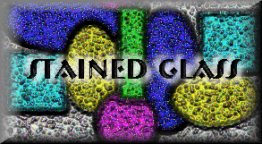
Then I cropped that last pic, buttonized it... added some white text... inverted the selection... applied chisel with a setting of 4... inverted again... hit it with white hotwax... then a white drop shadow with opacity of 100 (I think)... offsets of 5 and 5... then again with offsets of -5 and -5. Too bad I don't have a site to link to that has to do with stained glass. That's just what it looks like to me!


![]()
Click to go back to the splash page